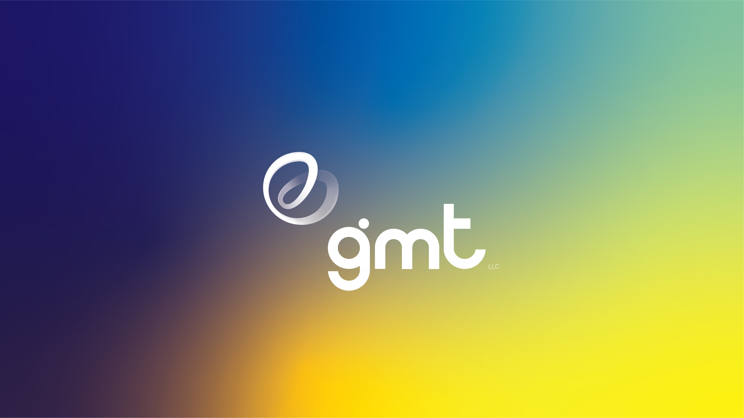
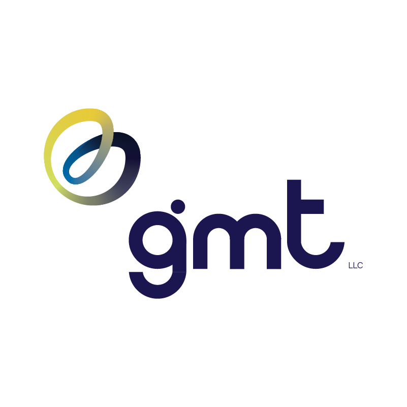
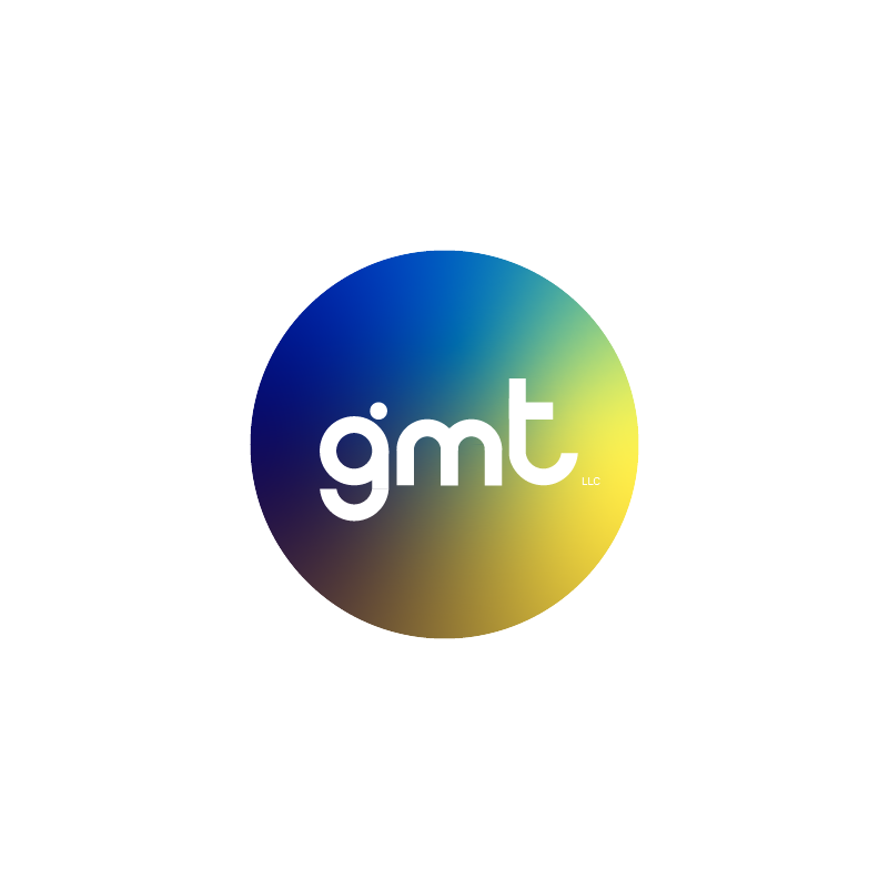
gmt
A REBRAND for one of puerto rico’s biggest food distributOrs.
Client:
GMT, LLC
GMT is a company that has a wide recognition in the frozen and refrigerated food industry, for which reason the rebrand had to maintain the brand’s gained recognizability while transforming into a modern and APPROACHABLE brand.
gmt
The new identity was designed to create memorability and Humanize the brand with a modern, familiar and accesible character. the redesign Offers a range of attitudes to embrace different audiences, provides dynamism in the visual aspects and REDEFINEs THE EMBLEM.


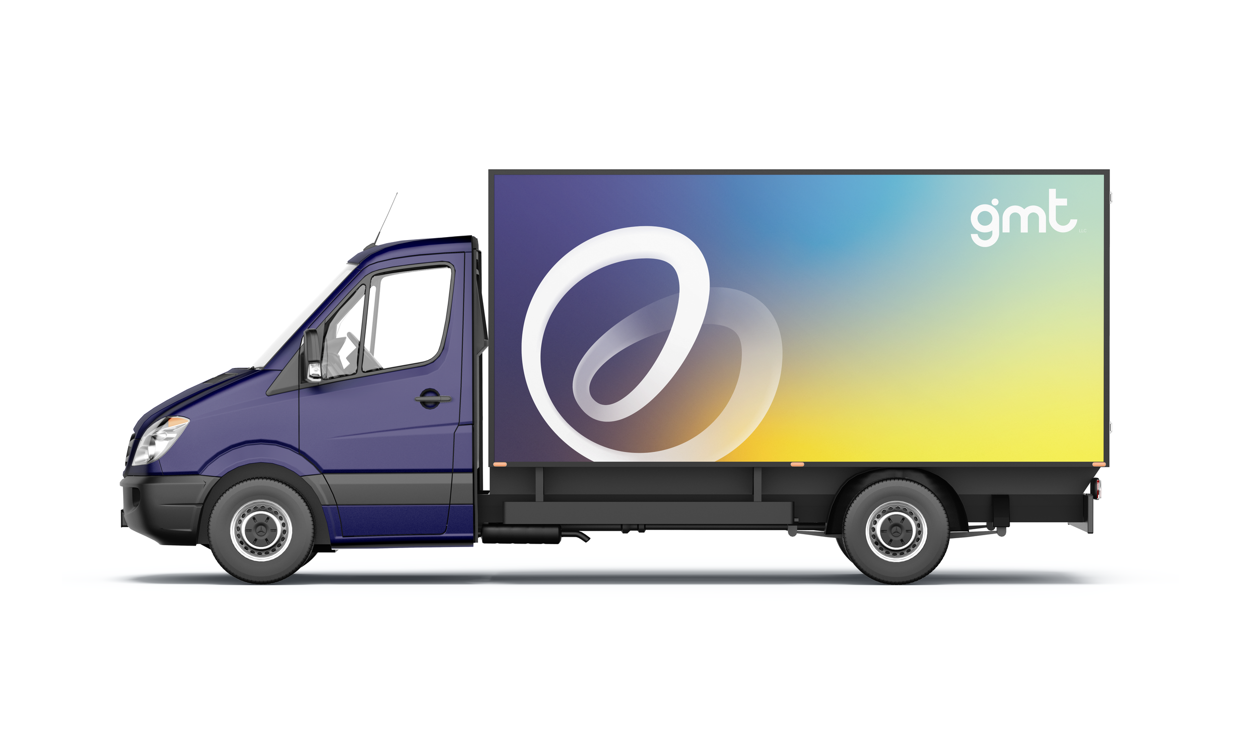

logo SYSTEM
a dynamic system to ACCOMMODATE different situations where the logos will be used.

spaces

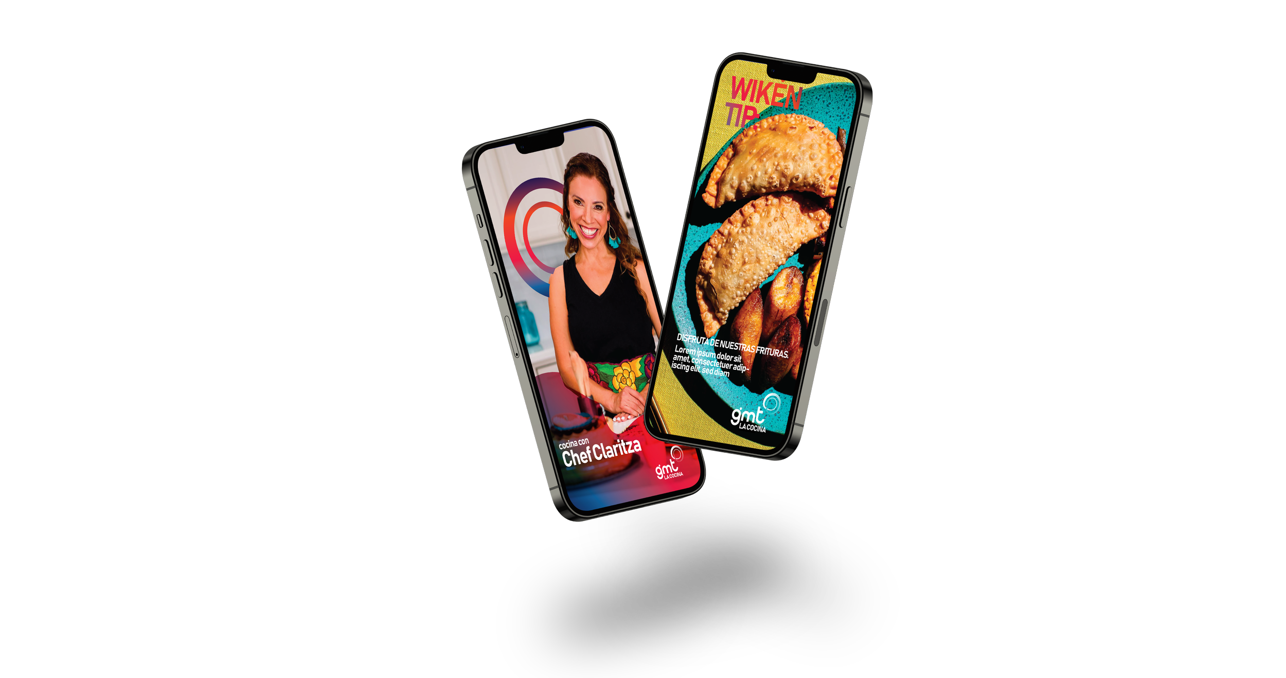
gmt PROGRAMS

We created a branded house to ACCOMMODATE the programs that gmt developed to engage with its different audiences. each sub-brand has distinct characteristics that respond to the program’s purpose and sets them apart from the others while adopting peculiar elements of the master brand to maintaiN cohesiveness.
the sub-brands ADOPTED from gmt’s brand the emblem’s linear and dynamic design and the gradient application of color. the palette schemes for the sub-brands were chosen after researching the psychology behind colors since we wanted them to respond and help advance each program’s goals and attitude.


GMT saludable is a program to promote a healthy lifestyle and wellness that can be achieved with the products that gmt distributes. the predominant color is green because it reflects balance and harmony.


GMT la cocina is a program that offers consumers delicious recipes to prepare with the products that gmt distributes. the predominant color is red because it portrays excitement and boosts the appetite.


GMT ambassadors is a program to enhance the great employees’ community and to ENCOURAGE them to continue building the company together. the predominant color is orange because it SYMBOLIzES enthusiasm.


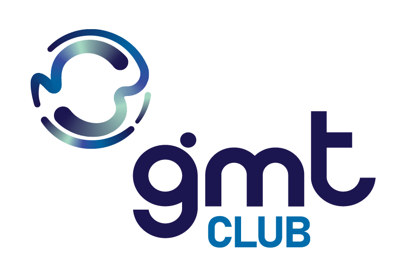
GMT club is a program to nurture the close relationship gmt has with its clients. the predominant color is blue because it represents stability and trust.


SOCIAL MEDIA
the graphics and videos we create for GMT’s Social media platforms are designed to enhace each of the products identity and to be set apart from the gmt brand.